Mobile-first Amazon listings: design for the 80% who shop on phones
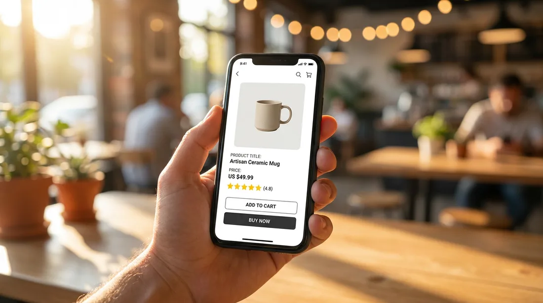
Here's the uncomfortable truth about the listing you designed on your laptop: most shoppers will never see it that way. The large majority of Amazon buyers are on a phone — often mid-scroll, one-handed, in poor lighting. If your listing only shines on a desktop, you're optimizing for the minority.
Designing mobile-first doesn't mean dumbing things down. It means making the important things survive a 5-inch screen.
Mobile changes the order
On desktop, images sit beside the title and bullets. On mobile, the shopper sees the image gallery first, then the title, then a truncated block of bullets they have to tap to expand — and A+ content is a long scroll below. In practice, your images carry more of the selling job on mobile than anywhere else, because that's what fills the first screen.

The "squint test"
Any text baked into an image will render at roughly a third of the size you're designing at. So before you approve any infographic, shrink it to thumbnail size and squint. If you can't read the callout, neither can your shopper. Bigger type, fewer words, higher contrast — every time.
Design the listing at the size it will actually be seen: about the width of two fingers.

Rules that make a listing mobile-proof
- One idea per image. Cramming four callouts onto one infographic works on desktop and turns to mush on a phone.
- Big, bold text. Short benefit-led callouts a thumb can read at a glance.
- High contrast. Light-grey text on white vanishes on a dim phone screen outdoors.
- Front-load value in the title. Mobile truncates titles — put the important words first.
- Lead A+ with the benefit. On mobile, modules stack into one long column, so the top module does the heavy lifting.
Test on an actual phone
Not the desktop preview — a real phone, held at arm's length. Look at the search results page first (does your main image pop among the thumbnails?), then the listing. If anything makes you pinch-zoom to understand it, it's not done. The shopper won't zoom; they'll scroll to a competitor.
The quick checklist
- Reviewed the listing on a real phone, not a desktop preview
- All image text passes the squint test at thumbnail size
- One clear idea per image, big and high-contrast
- Title front-loads value before mobile truncates it
- Top A+ module leads with the strongest benefit
Win the phone screen and you win the sale — because that's the screen where the decision is actually being made.
Does your listing hold up on mobile?
Send us your ASIN and we'll review it exactly how your shoppers see it — on a phone, free.
Get a free audit →